2/28/13

Bother!

Happy last day of February!

So this was going to be the first in two posts about my research I've been doing all week. I was going to say, don't worry! the research I'm talking about is the kind any book and illustrator enthusiast would love. I was going to show you the hordes of treasure I found on the eighth floor of the grad library. I was going to describe the trek I made up eight floors in the grad library to check out the Special Collection's children's Lit. How I once again did not adhere to the U's library strict code of conduct in looking at books. And how I stubbled wonderfully into several old and delicious copies of work by Arthur Rackham and E. H. Shepard. 

Looking at the Arthur Rackham Fairy Book
And then my joy overshadowed by that cloud of confusion they call "Copyright Law!" 

So I did some research to see if I could even show you some of the examples of their work that I found, but after an hour (oh what a wasted hour indeed!) I settled on not sharing them, even though they are pertinent to my discussion here on the blog, because I just couldn't figure it out. For one thing, this particular book by Rackham was published in 1933, if it had been published in 1921 I could have shared apparently... I think. As for the work by E. H. Shepard, fruitless + futile attempts to discover if they are or are not under copyright prevents me from showing you the wonderful work by E. H. Shepard, especially as regards his work for A. A. Milne. 

>_<         however, upon reflection I think I'll show details from a few just to illustrate my points. 


So with that introduction, settle in with a cup of tea to read my tale of discovery and admiration (with out the 20 or so great illustrations that were going to make it interesting) and try to imagine the rest instead. 

To start with, the books are so old and fragile you have to lay them in these spongy platforms to look at them, but it made me glad to handle them. Old books are better than new because they retain the memories of many hands; they are the point upon which time and kindred spirits converge. I was able in the time I had to look at three books: Arthur Rackham's Fairy Book, and E. H. Shepard's illustrations for At The Back Of The North Wind, by George MacDonald, and The House At Pooh Corner by A. A. Milne. So here's a few notes I made on both Arthur Rackham and E. H. Shepard, two illustrator's of note. 


One thing found interesting was that Rackham's book of fairytales contained three distinct styles of illustration that all worked together. He had full color illustrations with pen and ink, and watercolor washes. He also interspersed pen illustrations throughout the book, some more detailed and complete and other's just sketches. And finally, he also had a silhouette style that appeared several times throughout the book. I learned later that he developed the silhouette style post WW1. The reason this practice interested me is because I am not sure if all my illustrations in The Reluctant Sparrow will be full color illustrations. Because of time constraints, some might end up being ink sketches and not watercolor. The way that Rackham is able to successfully integrate pen sketches with complete watercolors showed me the possibility of doing this well. 
Detail from Arthur Rackham's Fairy Book.
This is okay, right?


Detail from Arthur Rackham's Fairy Book

Detail from Arthur Rackham's Fairy Book


Detail from Arthur Rackham's Fairy Book
I was also interested to see how Rackham used the frames of his illustrations on the page. The above detail from Rackham's illustration incorporates the page as part of the image and thus seems to exist without a frame. Below is an example of how he creates a set frame for his image, but still retains a hand-sketched and organic quality.
Detail from Arthur Rackham's Fairy Book
And again, another detail from one of Rackham's illustrations, this time showing how he breaks his frame with his illustration. In this detail it's hard to see, but the foot of the elephant extends beyond the bounds of the rectangle border he has set up.


E. H. Shepard

I believe my love for Shepard's work has already been evident on this blog. There is an expressiveness to his simple but expressive line quality that I admire and should like to imitate a little in my own work. But because gushing is not really an appropriate approach to discussing an artist's work, I'll try to refrain a bit. For discussing Shepard, I want to talk about two things; the first is the way in which his illustrations interact with the text on the page, and the second is his trees.

1. Text + image relationship.


E. H. Shepard's illustration from The House at Pooh Corner

Here, the text is moving around Piglet, so that he and the text almost appear in the same field. This happens again in this image below. Notice how the this style also emphasizes the lines that are broken out of the paragraph.


2. Trees. 
Shepard's trees are at the same time both heavy and light. They are homes and architecture for the character's to interact with, and simultaneously they are the light filigree that fluffs up the landscape. 


Illustration Detail from At The Back of the North Wind, by George MacDonald.

Illustration Detail from A. A. Milne's House at Pooh Corner
I think he achieves this by having extremely thick bases and trunks, and contrasting that with extremely tapered and delicate branches. He also gives great depth and shape to the trees by the way in which his lines follow the contours of the tree. 

Illustration Detail from A. A. Milne's House at Pooh Corner

Can't you feel the rough wind tearing through the treetop branches? 

Illustration Detail from A. A. Milne's House at Pooh Corner

And a small Pooh + Piglet down below. 

Illustration Detail from A. A. Milne's House at Pooh Corner

Illustration Detail from A. A. Milne's House at Pooh Corner


And a bit of light reading for over break :) Checked out from the Children's Literature room at the UGLY. I think I'll be visiting there again before I graduate. 

So there you have it. A recounting of my time spent with some of the children's lit at the U. I also went to the natural history museum this afternoon and talked with a lady about Seaside Sparrows and drew from some specimens she had. I shall perhaps do a post about it later, but for now, I'll leave you with a quote from A. A. Milne: 

“You can't stay in your corner of the Forest waiting for others to come to you. You have to go to them sometimes.”


2/22/13

Paginations + A Plan

Last week I took a blog detour and made a long post about my postcard making process. Today I want to get back to my development of The Reluctant Sparrow.

Over the past two weeks I have been meeting with Hannah Smotritch every monday afternoon to talk about The Reluctant Sparrow. She has been immensely helpful with figuring out how to move my book along from idea and concept into a more complete and finished iteration.

The first week we met I showed her the synopsis, my idea sketches, and the narrative writing. I also showed her a partial pagination I had made up of some illustrational ideas.

She immediately helped me by doing written spreads of the whole book. I had done this partially before but I had never really committed to them fully.

The blue inked spreads are the ones Hannah did based on her understanding of the plot. I went back and drew out my spreads as they existed then. There was a bit of a difference between the two. Something that Hannah pointed out was that I hadn't addressed what the climax was and ultimately why Mac decides to leave. She had assumed that it was because he realized that his love of home was in some part attributed to his friends, and ultimately his desire to go south is because he realizes that he misses them. 

I started re evaluating my plot arch. Why did he eventually decide to go? Perhaps it was because he missed his friends after all. So I wrote out a slightly different plot direction, one that focused more on Mac's relationship with his friends. I also wrote out under each spread, ideas for the illustrations and what I wanted to convey through them. 


After creating half-size paginations with the illustration sketches, I met with Hannah again. Once more we talked about the structure of the story, and looked at the illustrations as devices for the plot development. So I spiffed them up for the critique for Tuesday, made sure they were all nice and neat, and that the plot didn't have any blatant holes or problems. 

I got a pretty mediocre response in the critique. People were nice about it, and I was given a few ideas for some different places to do research for my illustrations, such as the natural history museum and the children's book collection at the University. I too was a little disinterested with my story; somewhere along the line I had dropped the subtle beauty it had and picked up a bunch of cliche. 

After the crit Camilla shared with me her thoughts about my story, voicing similar concerns I had, and encouraging me to go back and rework my story how I wanted it to develop. 

So I did. Below are the new spreads put up on my studio wall. 

Instead of focusing on the friends, I returned to focusing on Mac's reluctance. He stays because he isn't ready to go, because he loves his home and wants to spend more time there. He leaves because he does miss his friends, but also because he found that his home changed, and that he changed inside. He starts to wonder what migrating is like and starts to yearn for the south and the unknown, he isn't forced to go because of his loneliness. 

Yesterday I met with Camilla again and with both old and new storyboards in hand, created a final storyboard of the plot. I'm so happy with where I've ended up in the story. It feels like a coming home to the place my story grew from. 

I'm glad I met with Hannah because she helped me get into a good work flow and progress from where I was, and perhaps too she helped me realize the story I wanted to tell by showing me one I didn't. 


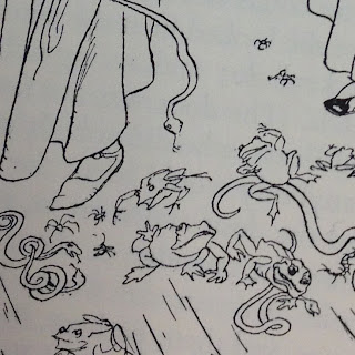
"The Fearsome Fellows" 

"Staying"

Detail from "A Snail Hunt"


"Untitled"


My goal for next week is to make sure I have all my research done. I want to visit the U's museum of natural history and see what I can find about the Seaside Sparrow. I also want to check out the special collection of illustrated children's books here and study how the masters do it. This coming week will be a prepping week so that when my March break comes the week after, I'll have all the tools and direction I need to jump into a wild frenzy of illustration. 


2/12/13

Late as a Postcard

This week's post (late but present!) is going to follow my journey of making a post card for the show in April.  Being rather ill all weekend, and confined to bed and tea, was rather detrimental to the whole postcard fiasco. To begin with, I haven't had time to work on the postcard image since I've been working on quick concept sketches for the book, rather than images I want published on 100 cards and hand out to whoever may show a partial interest in my book. In any case, I was able to sit down to do some sketches thursday night for post card ideas:


I first started by sketching some scene ideas that might look good as a postcard image. But then I didn't quite want to draw Mac, because then what if I changed something about him in the next few weeks? So I was playing around with objects for a while, especially the suitcase as a stand in for the idea of travel. 

Then Camilla, one of my GSIs, suggested making the postcard a cover of the book. This allowed for me to not picture Mac yet, and also to get out a nice image in the two days I had to finish it.

So I spent some time experimenting with type, and figuring out how I wanted the cover to look. Below  are some attempts at font, as well as some visual components to go along with it. 

and an apple.
I've been really inspired by Kelsey Garrity-Riley's work lately. And I was working on using Mac's environment as the visual element to go with the typography.
Below is one of her month wreaths: 
I was also looking around Pinterest for some hand lettering ideas. Because we can't have text on our postcard image I wanted to make it clear that it was part of the image, and integral to my project. 

I found one image in particular that I thought encapsulated the organic feel of the book, and was also legible for a children's book.
Via Pinterest


I used the found hand lettering as a reference and came up with the above as title lettering. 


And here's the visual component. The snail is a detail from an earlier illustration about Mac. 
He's  curiously addressing the title. 


Both elements together. 
After attempting small hand lettering I realized my folly and did it bigger, to add in on photoshop later. 


A photo of my studio while I was still happy, and still enjoying my cover...

THEN I painted it. 
And  I hated it, a lot. 

Here's what they looked like together...


My grandmother's pajamas. 

But it was saturday night and after a mild breakdown, and a declaration of apathy I drove in and uploaded it. How happy I was, then, to see Sunday that because of a few blessed procrastinators the deadline was moved to Tuesday! 

Here's my reflection on the first postcard design:
  1. Too delicate and intricate. I like both words immensely, but not on a postcard about a children's book. 
  2. The color. This was a fail on so many levels. Instead of getting the feeling of marsh + sea, instead we are left with grandma's pj pattern. 
  3. The pencil. It was suggested that I keep the pencil in and not ink it. What I learned is that while some people don't care for the ink, I do, and I missed it immensely. 
  4. The snail. I liked it pre watercolor, I hate it now. 

So I went back to the drawing board, and after a series of more sketches settled on this one. Below are the two angles I was working on: 


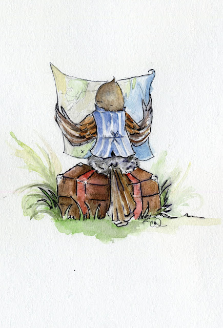
The idea for this illustration came from one of my quick sketches, after Mac has decided to leave, has packed his bags and is now looking at the way he needs to go. I returned to the suitcase because journey is so much of this story. 

I ended up going with this version. I thought that it gave us more of a perspective into Mac, as if we are part of his journey, looking at what he is looking at, planning along with him. Perhaps too I also wanted to draw the waistcoat :) 

 Below is the final sketch pre ink and watercolor:


And the finally the finale: 


And now I'm so happy with the postcard! 
It makes me excited to do more full illustrations for the book, and to share them with you. My only regret is not being able to use the title I worked on. I adore it and am hoping to still possibly use it for the book. 

So thankful for all those people who didn't turn their postcard files in on time :) 


2/1/13

Character Studies


This week I've been focusing on doing character sketches. The problem with posting on Monday is that it leaves a rather short week (3 full days) to post about all the work I've done. So really this is more of a check point before I go hurtling into the weekend. 

Here is the first watercolor experiment I've done with Mac. 


I want to keep him light and sprite. I've decided to use the yellow stripe above his eye as a type of eyebrow that will help to convey expression. I'm not really that happy with the vest yet. I like the periwinkle-blue undercolor, but I'm not at all happy about the dark stripes. I think I might have to go buy some masking paint so that the stripes can be white and lend a softer approach to the vest. I'm also thinking there will have to be some masking done around the buttons so they don't get muddy. I like how it fits him though. I also haven't added his spectacles yet. 

After talking with Jim about the character studies and illustrations, he suggested that I do several pencils sketches first that explore different angles and perspectives. It will be natural for me to always choose the profile of Mac, and while it may be easier to paint, it won't always be as interesting. 


The little bird in the bottom left labeled "Stupid" is actually a fellow I'm concerned about. How do I make make Mac look inquisitive without looking absent minded? 

So the plan for the coming weekend (and week) is as follows: 
  1. Do more character sketches of Mac, as well as of the Fearsome Fellows, The Marsh Wren, and Blue.
  2. Buy some masking paint--I've always wanted to try it but it is rather expensive. In other news, I received a $120 grant that I think I need to start spending. 
  3. Finish the half-size whole book pagination to show Hannah in my meeting with her on Tuesday. 
  4. Gather some narrative to show her as well.
  5. Start finalizing a post card image/text. It is due for me on Friday evening. 
  6. Go to B&N to look at children's books. Speaking of $120 grant, I really need to invest in some good research books for this project...

Something that Jim mentioned in my meeting which has been helpful to my thinking about the grid lock of text and image is to allow the image to influence the text. This seems pretty obvious, but as of now I've been working on them separately, or making the images based on the text. I want to experiment with them the other way around now. 

Enjoy the weekend!