I first started by sketching some scene ideas that might look good as a postcard image. But then I didn't quite want to draw Mac, because then what if I changed something about him in the next few weeks? So I was playing around with objects for a while, especially the suitcase as a stand in for the idea of travel.
Then Camilla, one of my GSIs, suggested making the postcard a cover of the book. This allowed for me to not picture Mac yet, and also to get out a nice image in the two days I had to finish it.
So I spent some time experimenting with type, and figuring out how I wanted the cover to look. Below are some attempts at font, as well as some visual components to go along with it.
.JPG) |
| and an apple. |
I've been really inspired by Kelsey Garrity-Riley's work lately. And I was working on using Mac's environment as the visual element to go with the typography.
Below is one of her month wreaths:
I was also looking around Pinterest for some hand lettering ideas. Because we can't have text on our postcard image I wanted to make it clear that it was part of the image, and integral to my project.
I found one image in particular that I thought encapsulated the organic feel of the book, and was also legible for a children's book.
 |
| Via Pinterest |
I used the found hand lettering as a reference and came up with the above as title lettering.
And here's the visual component. The snail is a detail from an earlier illustration about Mac.
He's curiously addressing the title.
Both elements together.
After attempting small hand lettering I realized my folly and did it bigger, to add in on photoshop later.
A photo of my studio while I was still happy, and still enjoying my cover...
THEN I painted it.
And I hated it, a lot.
Here's what they looked like together...
My grandmother's pajamas.
But it was saturday night and after a mild breakdown, and a declaration of apathy I drove in and uploaded it. How happy I was, then, to see Sunday that because of a few blessed procrastinators the deadline was moved to Tuesday!
Here's my reflection on the first postcard design:
- Too delicate and intricate. I like both words immensely, but not on a postcard about a children's book.
- The color. This was a fail on so many levels. Instead of getting the feeling of marsh + sea, instead we are left with grandma's pj pattern.
- The pencil. It was suggested that I keep the pencil in and not ink it. What I learned is that while some people don't care for the ink, I do, and I missed it immensely.
- The snail. I liked it pre watercolor, I hate it now.
So I went back to the drawing board, and after a series of more sketches settled on this one. Below are the two angles I was working on:
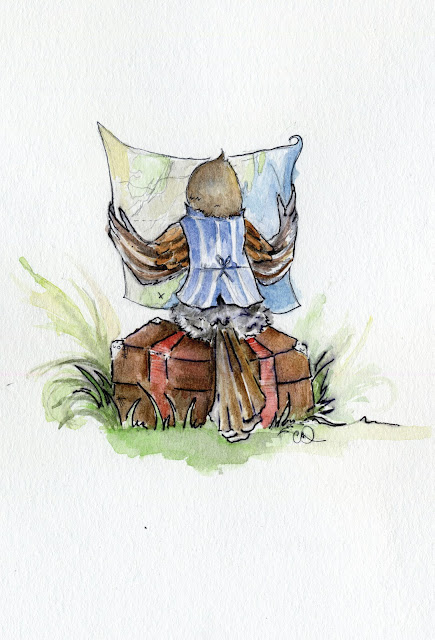
The idea for this illustration came from one of my quick sketches, after Mac has decided to leave, has packed his bags and is now looking at the way he needs to go. I returned to the suitcase because journey is so much of this story.
I ended up going with this version. I thought that it gave us more of a perspective into Mac, as if we are part of his journey, looking at what he is looking at, planning along with him. Perhaps too I also wanted to draw the waistcoat :)
And the finally the finale:
And now I'm so happy with the postcard!
It makes me excited to do more full illustrations for the book, and to share them with you. My only regret is not being able to use the title I worked on. I adore it and am hoping to still possibly use it for the book.
So thankful for all those people who didn't turn their postcard files in on time :)

.JPG)

.JPG)
.JPG)
.JPG)
.JPG)

.JPG)
.JPG)
.JPG)
.JPG)

No comments:
Post a Comment