Happy last day of February!
So this was going to be the first in two posts about my research I've been doing all week. I was going to say, don't worry! the research I'm talking about is the kind any book and illustrator enthusiast would love. I was going to show you the hordes of treasure I found on the eighth floor of the grad library. I was going to describe the trek I made up eight floors in the grad library to check out the Special Collection's children's Lit. How I once again did not adhere to the U's library strict code of conduct in looking at books. And how I stubbled wonderfully into several old and delicious copies of work by Arthur Rackham and E. H. Shepard.
.JPG) |
| Looking at the Arthur Rackham Fairy Book |
And then my joy overshadowed by that cloud of confusion they call "Copyright Law!"
So I did some research to see if I could even show you some of the examples of their work that I found, but after an hour (oh what a wasted hour indeed!) I settled on not sharing them, even though they are pertinent to my discussion here on the blog, because I just couldn't figure it out. For one thing, this particular book by Rackham was published in 1933, if it had been published in 1921 I could have shared apparently... I think. As for the work by E. H. Shepard, fruitless + futile attempts to discover if they are or are not under copyright prevents me from showing you the wonderful work by E. H. Shepard, especially as regards his work for A. A. Milne.
>_< however, upon reflection I think I'll show details from a few just to illustrate my points.
So with that introduction, settle in with a cup of tea to read my tale of discovery and admiration (with out the 20 or so great illustrations that were going to make it interesting) and try to imagine the rest instead.
To start with, the books are so old and fragile you have to lay them in these spongy platforms to look at them, but it made me glad to handle them. Old books are better than new because they retain the memories of many hands; they are the point upon which time and kindred spirits converge. I was able in the time I had to look at three books: Arthur Rackham's Fairy Book, and E. H. Shepard's illustrations for At The Back Of The North Wind, by George MacDonald, and The House At Pooh Corner by A. A. Milne. So here's a few notes I made on both Arthur Rackham and E. H. Shepard, two illustrator's of note.
One thing found interesting was that Rackham's book of fairytales contained three distinct styles of illustration that all worked together. He had full color illustrations with pen and ink, and watercolor washes. He also interspersed pen illustrations throughout the book, some more detailed and complete and other's just sketches. And finally, he also had a silhouette style that appeared several times throughout the book. I learned later that he developed the silhouette style post WW1. The reason this practice interested me is because I am not sure if all my illustrations in The Reluctant Sparrow will be full color illustrations. Because of time constraints, some might end up being ink sketches and not watercolor. The way that Rackham is able to successfully integrate pen sketches with complete watercolors showed me the possibility of doing this well.
 |
Detail from Arthur Rackham's Fairy Book.
This is okay, right? |
 |
| Detail from Arthur Rackham's Fairy Book |
 |
| Detail from Arthur Rackham's Fairy Book |
 |
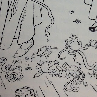
| Detail from Arthur Rackham's Fairy Book |
I was also interested to see how Rackham used the frames of his illustrations on the page. The above detail from Rackham's illustration incorporates the page as part of the image and thus seems to exist without a frame. Below is an example of how he creates a set frame for his image, but still retains a hand-sketched and organic quality.
.JPG) |
| Detail from Arthur Rackham's Fairy Book |
 |
| Detail from Arthur Rackham's Fairy Book |
And again, another detail from one of Rackham's illustrations, this time showing how he breaks his frame with his illustration. In this detail it's hard to see, but the foot of the elephant extends beyond the bounds of the rectangle border he has set up.
E. H. Shepard
I believe my love for Shepard's work has already been evident on this blog. There is an expressiveness to his simple but expressive line quality that I admire and should like to imitate a little in my own work. But because gushing is not really an appropriate approach to discussing an artist's work, I'll try to refrain a bit. For discussing Shepard, I want to talk about two things; the first is the way in which his illustrations interact with the text on the page, and the second is his trees.
1. Text + image relationship.
 |
| E. H. Shepard's illustration from The House at Pooh Corner |
Here, the text is moving around Piglet, so that he and the text almost appear in the same field. This happens again in this image below. Notice how the this style also emphasizes the lines that are broken out of the paragraph.
2. Trees.
Shepard's trees are at the same time both heavy and light. They are homes and architecture for the character's to interact with, and simultaneously they are the light filigree that fluffs up the landscape.
 |
| Illustration Detail from At The Back of the North Wind, by George MacDonald. |
 |
| Illustration Detail from A. A. Milne's House at Pooh Corner |
I think he achieves this by having extremely thick bases and trunks, and contrasting that with extremely tapered and delicate branches. He also gives great depth and shape to the trees by the way in which his lines follow the contours of the tree.
 |
Illustration Detail from A. A. Milne's House at Pooh Corner
|
|
Can't you feel the rough wind tearing through the treetop branches?
 |
Illustration Detail from A. A. Milne's House at Pooh Corner
|
|
And a small Pooh + Piglet down below.
 |
Illustration Detail from A. A. Milne's House at Pooh Corner
|
|
 |
| Illustration Detail from A. A. Milne's House at Pooh Corner |
And a bit of light reading for over break :) Checked out from the Children's Literature room at the UGLY. I think I'll be visiting there again before I graduate.
So there you have it. A recounting of my time spent with some of the children's lit at the U. I also went to the natural history museum this afternoon and talked with a lady about Seaside Sparrows and drew from some specimens she had. I shall perhaps do a post about it later, but for now, I'll leave you with a quote from A. A. Milne:
“You can't stay in your corner of the Forest waiting for others to come to you. You have to go to them sometimes.”


.JPG)
.JPG)
.JPG)
.JPG)


.JPG)


.JPG)
.JPG)
.JPG)


.JPG)
.JPG)


.JPG)
.JPG)
.JPG)
.JPG)

.JPG)
.JPG)
.JPG)
.JPG)

.JPG)


